Bringing you the very highest quality custom mural art and graffiti stylings since 2009

Latest

Backyard Growers’ Mystery Machine

Backyard Growers Van, Gloucester, MA

Every so often I get a project that I’m stoked on from the word “go”. This magical mystery-machine for Backyard Growers of Gloucester, MA was one such gig. In the dead-dog heat and humidity of August 2016 I was contacted by Lara Lepionka, leader of this local non-profit that cultivates quality organics at the local level. Lara wanted something bold and fun to grab attention for her project as she flosses the Fishtown streets. After some charcoal black-book sketchings, we settled on an anime-esque rendering of fantastic vegetables and vines, coupled with a B-girl gardener set against the windmill-dappled skyline of our fair city.

Backyard Sketch 1 Backyard Gardener

I set to work on what must have been a couple of the hottest days of the year, working with an intern from UMass Amherst whom I’d taught years earlier while painting theatrical sets in an extra-curricular program for the local high school. As per usual, the entire project was completely freehanded, without template, stencil, etc. (except for the pre-existing “Backyard Growers” decals). A variety of paints were used, from Rustoleum high-pressures to Belton low-pressures and Plutonium professional cans. After a solid week of curing in the record-setting heat, the whole thing was ready for a final gloss-clear-coat to preserve and protect the matte colors from abrasion and UV damage. For this step I used an undercoat of Duplicolor ClearGloss followed by a top-coat of top-secret automotive-grade canned-epoxy high-gloss clear-finish. The resulting aesthetic is so smooth and delicious, you might just want to take a bite out of it:

Backyard Detail 2 Backyard Detail 1 Backyard Detail 4 Backyard Detail 5

In true Massachusetts fashion, this van has subsumed the folklore of the “Mystery Machine”, which was Scooby’s ride in the famous Hanna-Barbera cartoon of the late ’60’s/early ’70’s. Legend has it that Scooby Doo’s characters were based on archetypical students from five prominent colleges in western Mass. (including UMass Amherst!) Are you an entrepreneurial graduate in the bay state with a business of your own to promote? Then click the contact info above and schedule your own Mystery-Machine-make-over today. Otherwise, give Lara a wave and shout “Hey Scoob!!!” if you see her tooling around town in this bad-boy, and don’t forget to check out her amazing project at http://www.backyardgrowers.org

Cheers y’all.

Backyard Detail 3 Backyard Passenger

Advertisement

Sour-Apple Pucker-Pyse


"Sour Apple Jolly Rancher" @Beverly, MA


Summer 2016 in Massachusetts has been hot, muggy swampfest of a season, the heavy air sticks to the skin like sugar-candy. I used to dig on the sour-apple suckers as a kid in this kind of weather. Sometimes I’d drop an unwrapped Rancher onto the hot blacktop and watch it melt down into a slick glycerin puddle. I still have a sweet-tooth for that cloying style as an adult–the glowing translucent green-apple candies wrapped in pink-striped plastic.

Jolly Rancher 9 Jolly Rancher Detail

Mr. John Clemenzi, owner of the industrial park and the graffiti-wall that it includes, dropped by while I was painting for a chat. The north shore scene owes a lot to this guy, he’s provided us all with a free and open venue to paint and express ourselves in an otherwise inhospitable environment here in New England. Plus the man genuinely appreciates good pieces of graf… He’s gone out of his way to maintain the free wall despite endless headaches like gang activity on his property and vandalism on the sides and front face of his building; give the guy a break y’all.

Jolly Rancher 1 Jolly Rancher 5

Nothing sets off a brilliant lime-to-poison-green fade like a deep-purple outline. This one is brought to you by Belton’s Anthracite Grey. The Yellow Rope is Flame’s Cadmium Yellow, and as always, the background is only the finest Ben Moore Ultra-Spec Matte-Black. Superior Toy-coverage and lightning-fast dry-times are key. Cheers y’all, you can catch me at Nichol’s candies off exit twelve on the only Cape worth visiting.

Jolly Rancher Detail 2

Jolly Rancher

Danny Diamond’s Post-Graffiti Landscape

hombre flatrocks split

Summer is officially underway in Gloucester, Massachusetts. The St. Peter’s Fiesta has come and gone, making way for the city’s annual Independence Day celebration and its colorful “Horribles Parade”. The Horribles legacy is that of a rag-tag, ramshackle community effort full of home-made floats and kitschy DIY costumes. This year, Danny Diamond was commissioned to paint a float for the Cape Ann Farmers market: http://www.capeannfarmersmarket.org  He was asked to paint an interpretation of the theme “Rising Tides”. This phrase calls attention to rising global sea levels and the crisis of climate change, it is also a catch-all reference to both the enviornmental changes happening and the increasing ‘green-action’ that we’ve been seeing lately in response to this crisis. Danny was inspired by a piece from local photographer David Fernandes depicting one of the gorgeous sunsets that we have here on the northwest side of the island. If you’d like to see more of Dave’s stuff, check him out at:

https://www.facebook.com/Harbors-Edge-Photography-1583461305255164/

Horribles 2016-0576

Artists have been coming to Cape Ann for centuries because of its unique natural light-phenomena and its seemingly endless ocean vistas. Using Dave’s photo as a reference, Danny painted a vibrant sunset-scene in free-hand aerosol paint on the side of an Isuzu Hombre. The truck belongs to Gloucester writer and community activist Amanda Cook and her husband, Gloucester High School Principal James Cook. For the driver’s side of the Hombre, Danny painted the slogan “Rising Tides” in bold ‘straight’ graffiti lettering. Local photographer Martin Del Vecchio was kind enough to shoot a time-lapse video of the driver’s side, which can be viewed here:

Horribles 2016-0300

Danny is currently scheduling new projects for the Fall of 2016, including automotive re-finishes. Please refer to the contact information at the top of the page.

Horribles 2016-0010

Horribles 2016-0193

Pyse’s Symbiote sighted in Deadly Dorchester

Venom

As the solstice approaches, Pyse and co. kick off the summer season with a symbiotic combination of style and character. This Dorchester, MA production features Marvel’s infamous anti-hero “Venom” beset by two of most diligent writers and documenters of greater Boston’s hardcore graffiti at this moment in time. I have always been intrigued by the story of Eddie Brock, aka “Venom” as it was laid out in the Amazing Spiderman comics that I read as a kid in the late eighties. My favorite episodes are actually the prequels to the appearance of Venom that describe Spiderman’s initial encounter with a Toxin lifeform from the Planet of the Symbiotes. Spiderman bonds with this entity; it becomes his new biological spider-suit and endows him with superhuman and telepathic powers that are beyond even those that he acquired from a radio-active spider-bite. Of course, Spiderman is initially elated by his enhanced abilities, but he gradually discovers that the Symbiote is in fact malignant and evil; it is using Spidey’s powers to its own ends as much as he is using it to his own. As a kid, I hung a poster in my room of Spiderman in his original bright red-and-blue suit in a brick-walled sewer duct beneath Manhattan. In this large panel by Todd McFarlane, he crouches in front of the limp, black-and-white alien Symbiote that he had nailed to the wall with wooden spikes driven into the mortar. Later in the story, Peter Parker’s rival Eddie Brock finds the discarded Symbiote and bonds with it, gaining powers similar to Spiderman’s, but Venom is more hulking and psychotic; the effects of the same Toxin upon a looser, less healthy mind… What was once a piece of Spidey’s identity, a part of his very physical being and consciousness, comes back in another form to haunt and do battle with him long, long after their separation.

Venom pan 2

With that legend in mind, I stepped out to Dorchester, the neighborhood just across the Red Line tracks from my Alma Mater UMass Boston. Sometimes referred to as “The Rock” because of its resemblance to Alcatraz, UMB sits out on Harbor Point, a giant brick-and-mortar monolith designed to be riot-proof by architects of the Kent State era. The school is visible from Dorchester, which is every bit as crowded and built-upward-upon-itself as I remember. The wall in question is nestled between several multi-family, three-story apartment-buildings, I realize that I’m about to paint a Super-Villain that will be visible on a daily basis to twelve or so families in the immediate vicinity. My depiction of Marvel’s iconic anti-hero is executed on a matte black base shaded in MTN blues. Layers of opaque paints by German Montana and translucent whites and greys by Belton give Venom the sickeningly salivating tongue that he’s famous for–a slick, serpentine appendage followed up by sharkish rows of jagged and filthy fangs. He is the stuff of nightmares for neighborhood kids fascinated at first, as I was, by the art itself, and then later by the elegance of the metaphor that it delivers. He is a reminder of what lies over your shoulder, stalking you through the streets and alleyways that were the daily walks of your past.


Venom. Pyserock

Master Signature-Stylist @Minglewood Tavern

Jam 180 Premier

Upon returning to the East Coast, I’ve just kicked off my Summer residency on the north shore of Massachusetts with a chalk-art installation at waterfront dining destination Minglewood Tavern/Latitude 43 Restaurant in Gloucester, MA. Minglewood’s owner hails from New York City, as does my late mentor and legendary signature-stylist, Jed Richardson of Manhattan. In a strange sequence of coincidence (or synchronicity), Eric DEAL, CIA–a former artistic associate of Jed’s, uncovered one of his original sketches from the 90’s and brought it to my attention:

Jam 180 Sketch

At the time, Jed was writing “JAM 180”. I took the liberty of reproducing my man’s letters on the chalk-board-painted crescent-soffit that encircles the lounge area of the bar; I don’t think Jed would mind. Jed was a master-stylist with a chisel-tipped magnum sharpie. He could produce calligraphic wildstyle signatures that were hyroglyphically complex and yet hauntingly familiar and organic (like the one pictured in india ink at the top-left of the sketch). It’s always refreshing to see his racy, rock&roll style light up a room. Even in a medium as raw as chalk, the smooth groove of his letters pulls the eye gracefully across the room and back like a punk-rock dance-partner.

Minglewood Pano

Revolt 1

The reverse of the soffit which faces the street is a reproduction of NYC Subway bomber REVOLT’s work, he was a contemporary of Richardson’s. The subway-car image races toward several stanzas of a poem about MBTA train-line graffiti that I wrote as an undergraduate in Creative Writing at UMass Boston in 2006. The text of the poem is executed in the stylized-script that I developed over ten years based on Jed’s letters and the New York model of the graffiti-alphabet mixed with my own flavors and flares.

If you’ve never been, head on down to Minglewood Tavern/Latitude 43 in Gloucester for their craft beers, unique menu, and sushi bar. Check them out at http://www.minglewoodtavern.com or http://www.latfortythree.com. They have waterfront outdoor-dining that faces scenic Gloucester Harbor and a warm, comfortable atmosphere inside featuring fresh New York Stylings courtesy of Skribblefish.com. Cheers,

-d

Minglewood Pano 2


The Queens of Style in Santa Cruz

Queens pan
First things first: I’m so very grateful to have been well-received and taken care of by my Californian friends and business associates. Santa Cruz County is a kind and peaceful place; in the mild indian summer here I have found the space and opportunity to express my creative vision. The focal point of my vision currently is the rendering of large-scale portraiture in low-pressure aerosol paint using greyscale and monochromatic palates. Knowing that most of you will likely experience these pieces on small monitor (or even smartphone-sized) screens, I have tried to express the scale of the work by standing-in some of these frames. However, the experience of sharing a room with portraiture of this scale is quite different from remote digital viewing. In person, one can approach the wall and enjoy each microcosmic moment of the piece: the texture of smoothly diffused colors, the multi-shaded iris of an eye, the recklessness of floor-length drips… Afterward, one can step back again to watch all of these moments combine into something greater than the sum of its parts.

Hearts detail Q

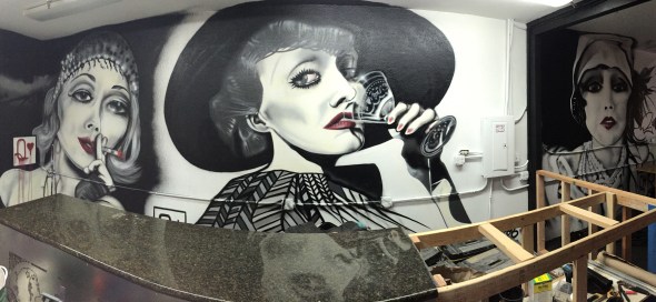
One of my favorite markets to work with is the bar and nightclub industry. Recently, I’d been seeking the proper venue to bring my greyscale illustrations into a nightclub setting. The opportunity arose when my good friend Dr. Pride introduced me to Bobby Card of Capitola. This March, Bobby opened an exclusive speakeasy on Coral St. in Santa Cruz. A follow-up to his former after-hours joint “Shades of Green”, this club is dubbed “The Greenhouse Studio”. It features large-scale pieces by veteran Santa Cruz muralists Taylor Reinhold, Casey Landaker, and myself. Bobby’s vision for the Greenhouse Studio is a retro-prohibition-era art club that blends modern EDM and Burlesque with 1920’s Jazz music and Flapper-Girl/Pinstriped-Gangster fashion themes. My contribution to the ambiance covers a 10’x30′ space behind the marble-topped bar, depicting three seductive elements of cabaret culture in the form of three playing-card Queens.

Queen of Diamonds

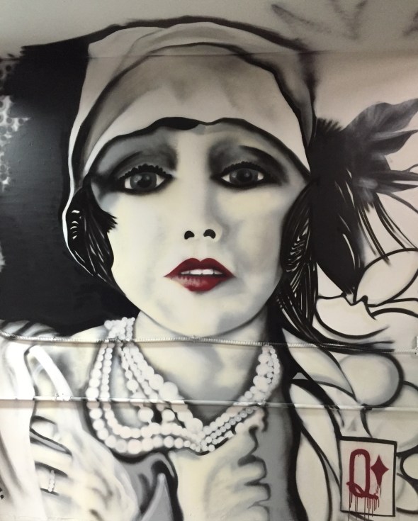
The first subject of this mural is the right-most section, the Queen of Diamonds. She was painted from rough to finish in six hours in a single evening. I don’t employ grids or projections in my work; I study a photographic reference and enlarge the image with my mind. This Queen came into focus most easily of the three– bearing a dead-on perspective and a high-contrast composition, she represents the vice of vain material wealth. She clutches at thick strands of pearls around her neck and sports a Diamond engagement ring on her left hand– a symbol of a love affair with the age itself. She was a pleasure to paint; her expression is of youthful affection and naiveté; of the exuberant sweetness that directly preceded the Great Depression. The silk that covers the left hand and the feathers of the headdress are my favorite moments in this portrait, as well as the balance in the arch of her glossed lips.

imageDiamonds detail Feather

Diamonds detail Ring

Queen of Spades

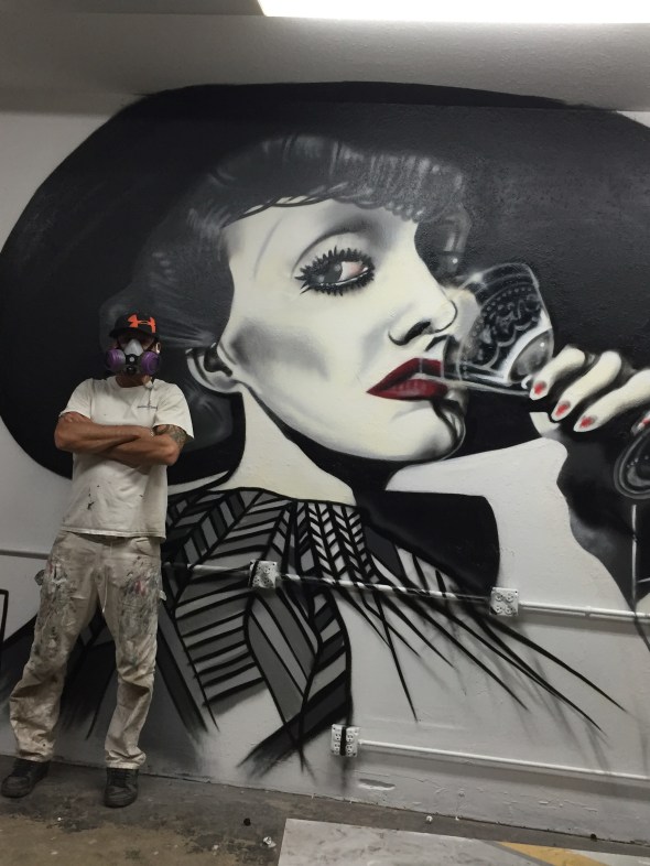
   My second effort, the Queen of Spades, was painted the very next morning in a comparable amount of time. She is the centerpiece– most treacherous of the set, under a suit that represents alternative and extreme lifestyles in popular culture (think Motorhead’s “Ace of Spades”). She is ominously seductive, sipping at the illicit poison of the era from an embossed cocktail glass. The glass itself is the most difficult technical detail of the entire mural– painted in translucent Magic-White with Shock-White highlights. Capturing the shape of a transparent object with a spray-can was an entertaining challenge made possible by a cool hand and Montana gasket-technology. The Queen of spades looks like a gal that you might want to reconsider crossing, a whiskey baron’s daughter or some such; sizing you up with a glance as she drains her glass. “If you like to gamble, I tell you I’m your man. You win some, lose some; it’s all the same to me.”

Spades detail Glass

Spades detail dress

Spades detail EyeQueen of Hearts

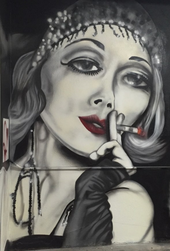
The third and final piece of this installation is the Queen of Hearts. She was painted after two days’ rest in three sessions, which is to say she gave me the most trouble. A lit cigarette rests in her gloved hand and flapper-girl-style beads dangle from her brow and ear– these were the most challenging details of her outfit. The Queen of second-highest suit represents the oldest profession’s presence in the room: the vice of sexuality as it is seen accompanying other vices. She leans into the mural from a dark, smokey corner of the room, her glassy eyes catching flashbulb bursts. The rounded curve of her right shoulder traverses the corner of the room, streaked by gloss-red drips that reach the concrete floor. Her expression is gentle yet savvy; she might be the concierge of the room as she introduces the viewer to the other two Queens. “Some say Diamonds mean money for this art, but that’s not the shape of my heart.”

-Sting

Hearts detail cig

End Prohibition

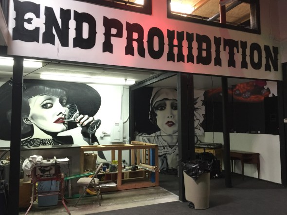
“The Greenhouse Studio” of Santa Cruz opened with an all-night Prohibition Party on March 26th, 2016 to a classy, pin-stripe-and-feather-clad crowd. The evening featured the live, anachronistic musical stylings of Post Street Rhythm Peddlers– a local outfit that integrates sultry female lead vocals and blazing brass solos with a solid side-show backing band. Second set belonged to Dark Rose Cabaret– a sexy collision between conventional stripping and political performance art. They gave Bobby a run for his money with a lapdance onstage… DJ Little John headlined the bill, spinning beats deep into the a.m. Meanwhile, the newly re-finished steel-and-marble bar was tended all night by a couple of local Flapper-girls in Red, accenting the lips of the three Queens relaxing behind them. Bobby Card now proudly owns the showcase piece of my 2016 winter residency in Santa Cruz, California, which as I write this has come to a close. If you’re in the area, I encourage you to pay him a visit at 360 Coral St. to see this piece in person. Next week I’ll be traveling to Portland, OR, and then back to Massachusetts for the Spring season. I’m currently booking projects for the Spring/Summer; please refer to the contact link at the top of the page if you too are interested owning a custom mural for your home or business. Cheers,

-Danny Diamond

Greenhouse BarDark Rose CabaretPyse and the Queen of Spades

copyright 2016 skribblefish.com

Paint and Terror in Tweakerville

Tweakerville Pyse


Fresh from a short series of serious productions, Dr. Pride and I decided it was time to relax with some dank letters at a no-hassle spot up in the mountains. The wall in question is in a hella-cutty section of Corralitos, CA, a half-hour on 1-South from Santa Cruz. Pride whips around a little Toyota 4×4 5-speed that feels an awful lot like Santa Cruz ‘s famous wooden rollercoaster “The Big Dipper” as he jams it through mountainside switchbacks and no-guardrail hairpin-turns. I’m about to lose my tacos, hanging my head out the window; I remember that methamphetamine is a big damned problem in rural California as I examine the makeshift living structures and rusted-out muscle-cars that litter the red-clay hillsides. We roll up to the spot on a small plateau, passing a stationary school-bus filled with furniture and a set of indoor appliances left to rust into the Redwood trees. The neighborhood kids have been painting thick, black swastikas on every available surface; Pride reminds me that although the spot is chill, “Hey Bro, keep your headphones low and don’t rattle your cans too loud.” As he steps out of the truck, he notices that his gallon of bucket-paint has broken open during the bumpy ride up the hill, bathing his truck bed in robin’s egg blue. He curses as he backs the truck up directly to the wall and begins rolling-on paint from a standing position in the bed…

Tweakerville view

All tweakers and spilled paint aside, the Corralitos wall is a magnificent place to paint. The view over the valley is breathtaking, and every once in a while a bald eagle flies overhead and makes you feel like you’ve stumbled into a Coors beer commercial. My piece du jour is painted in Boston’s version of ‘Connector-style’ with a Pimp-Violet and Shock-Black fill-in littered with bullet-holes and punctuated by Purple verticals that give way to grey bubbles. The whole thing is sealed-up with pin-wheel highlights in Translucent-White and set against a field of spheres that suggest a depth of field beyond the bright blue three-dee-drop. The dripping rope is MTN 94’s Magenta, or as Pride pronounces it, “Ma-HEEN-tah!!!”

Tweakerville Tiger

Dr. Pride uses his alternate name, “TIGER” for this piece; his letters tip-toe through the grass draped in a Melon&Cream outline. Tiger sees my spheres developing in mid-composition and decides to bite ’em, mixing his own version with broken aqua-marine bricks that suggest a shattered stability beneath the letter-structure. His outline is antiqued by spar-and-circle cut-backs that sharpen-up an already angular style. He crowns his black-honeycombed signature with the phrase “In God I Trust.”, which is either a statement of faith or a nod to the illuminati; I can never tell with this guy…In any case, a good time was had by all and we made it home for dinner. The ride back downhill was worse than the ride up. Pride’s whip got a new paint-job, and the tweakers of the Corralitos hills have some brand-new wallpaper courtesy of Skribblefish.com, Boston.

Tweakerville Beantown


Backyard Bombshell in Soquel

Soquel Bombshell Pan

How do we reconcile the duality of our own awareness? What kinds of psychological gymnastics are required to balance the waking life against the dreaming one? How can we convince internal enemies to break bread together within ourselves?: The yearning for stability vs. the thrill of spontaneity, the drive to create vs. the need to consume, the longing for connection vs. the sense of self-preservation, etc… I’ve been re-weighing these balances while focusing on greyscale portraiture here in Santa Cruz, California.

There are two ways to paint these pieces: from light to dark, or from dark to light. The former fades into existence, advancing from a blinding blank background like a piece of photo-paper dropped into the toner. The latter flickers forward from an endlessly receding void, like a familiar face pronouncing itself as it’s met by candlelight in a dark room. This latest freckle-featured addition to my Greyscale Girls series is painted from dark to light–negative values transforming to positive ones–a pixie-faced beauty beaming from beneath the Bougainvillea.

This collaborative piece resides in Soquel (pronounced “so-KEL”), a serene village to the east of Santa Cruz that remains a cradle of California surf and skate culture. When my partner and I strolled into the spot, our client was stripping old plywood from a backyard bowl to make way for a straight-up homemade half-pipe. Construction is due to be completed by June; the finished atmosphere will showcase both local skateboarding talent and the cutting edge of spray-can culture.

Dr. Pride rides shotgun in this speedy afternoon production, painted in under four hours circa Valentines Day, 2016. The fellow who commissioned this piece is raising a teenage son who dabbles in tagging (the purely signature-oriented side of graffiti); he was stoked to have some pros roll through and show the kid what’s possible. Make no mistake, spray-can art is the largest folk-art movement in modern history; it’s global, and it’s limits as a medium have not yet been touched, even as a new generation comes up on the block.

imageimage

image

image

image

Dr. Pride and Mr. Pyse mark-up Monterey Bay

Sin City Select

Pyse vs. Pride Mission Pano

Two years is too long to be without Californian comfort. I’ve just returned to sunny Santa Cruz County a mere hop and skip ahead of Nor-eastern snowfall. After a couple days of shaking off the jet-lag with Peruvian coffee, farm-stand kiwis, and tamales de pollo, I headed over to the West side to christen a private music studio with ancient rites of hieroglyphic glamour. An extensive selection of prescription-strength Montana paint (Spanish and German) is available over-the-counter at Palace Art on Pacific Ave. in downtown Surf City (they even carry the “Mystic” [German] transparent colors that I’m so fond of.) After selecting a seamless greyscale, I met up with hometown homegrown-scientist Dr. Pride at the spot on Mission St. My subject for the evening was a breathless blonde black-and-white photograph; languishing in her good looks; lips gently parted in subconscious suggestion of speech or sex–a duo-chromatic composition that combines graduated shading with fluid gesture. She’s painted in the “Sin City” style of selective embellishment –Montana Whiteline “Hot Lips” Gloss-finish Red is the only color that compliments the frame. This piece was painted in haste in a single evening on white-primed interior cinder-block. Dr. P-Ride adjusts the adjacent wall with a classy California Thrash Kids chaos-piece that boasts six color-schemes in a single bound. The kind and good doctor has a piecing style so technical that it requires full schematics and an undergrad in urban engineering to decipher. Meanwhile, the prevailing theme in my life, and my art currently, is simplification: painting in a loose, open-ended style that feels like a sketchbook-page spread-out on the bricks, or getting on a cross-country flight with a backpack and a skateboard; just a couple of things left to say and a cool hand to spray them with.

Cheers,

-Pyse

Sin City Close-up

Pride Mission

Sin City Pose

Ice-cold Kill in the Wilds of Maine

Vinalhaven Fuel Co.

Vinalhaven Fuel Co.

Sometimes you merely wound your prey with the initial shot, and you have to track it into the deep woods. Unsatisfied with a single pass at this cold color scheme of white/grey, galaxy purple, and ice-blue, Pyse travels north to paint a sister-piece to his Halloween production. Beset by a dramatic view of the working waterfront , this freezer-burner adorns the wall of the Vinalhaven Fuel Co. amidst a scrap-yard of rusting propane tanks and retired tanker trucks; it sports an oil-slick satin-black fill-in with natural leopard-skin camouflage, violent neon-orange splatter, and bleeding red bubbles. The outline is a calligraphic, lethal defense mechanism featuring mirrored-laser-beam-blow-outs on all sides and led-heavy serifs that tap the underground oil tanks; it’s a moose-crusher. The wall will be at its finest when the island lies buried in winter–a cold, crisp white sculpture rising from the snow–an icebreaker for bored local kids looking to get stoned on style. Vinalhaven is one of the Fox Islands located an hour and fifteen minutes off of the mainland across West Penobscot Bay; it supports an annual population of fifteen-hundred. Rumors abound on the island, they travel through a tight social fabric; the word on the street is that this piece was painted sans permission by southern interlopers. Gossip is the grease that keeps graffiti moving; or as my friend says “People create their own narrative.”

Vinalhaven Fuel Co.

Vinalhaven Fuel Co.

Pyse-cold Kill Process 4

Vinalhaven Sunset

Vinalhaven Fuel Co.